Mann Pools
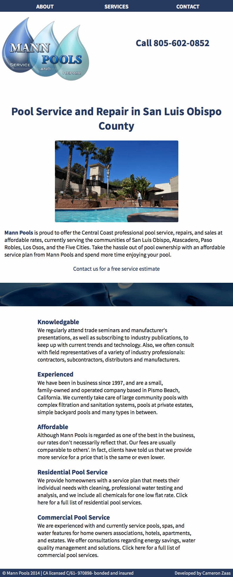
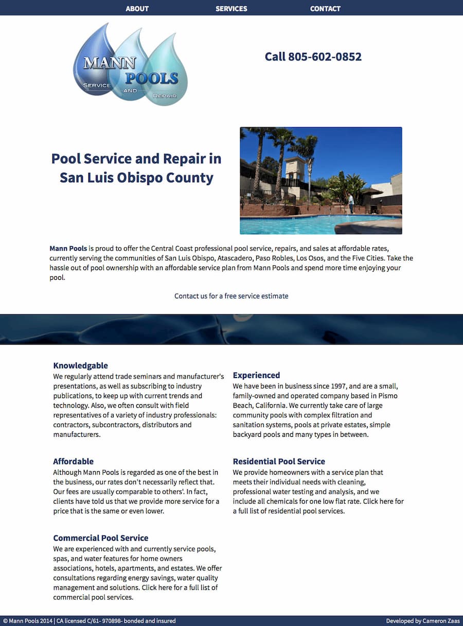
I designed the layout where the content is easily readable and comprehensible. I used the latest practices of HTML, Sass/CSS, Javascript, and some PHP to create this responsive website.
Below you see three view-ports, small, medium, and large. When making websites I use the mobile first approach and this leaves no device size out. I start with the smallest view-port, then expand and create breakpoints when necessary.
Visit Mann Pools
Small Viewport

Medium Viewport

Large Viewport
